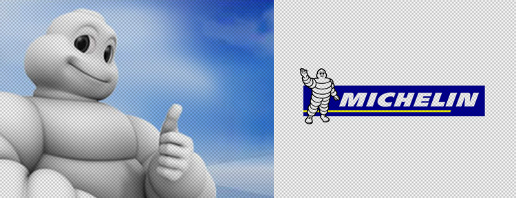
The Bibendum character of Michelin was conceived in 1898 when Edouard Michelin noticed the likeness of a stack of tyres to the body of a man. Bibendum first appeared in an advertising poster raising a glass of nails and broken glass - toasting to all road hazards, none of which threatened the Michelin tyre. His early form, with thin rings, echoed the shape of tyres at the early part of the 20th century. In time he became fatter and more rounded to reflect the shape of tyres that are like the tyres of today. Bibendum reflects the softer elements associated with the Michelin brand. With a larger than life personality, he exudes wit, charm and humour. From around 1935 until 1998 Bibendum’s form changed, he became generous in scale and well rounded. He was a charming, friendly and appealing character.
프랑스 리옹에서 개최된 세계 박람회장에서 미쉐린 형제는 자신들이 전시해놓은 타이어가 쌓여 있는 모습에 절묘한 아이디어를 떠올려 팔과 다리만 그려붙이면 사람처럼 보이겠다고 생각했고 이렇게 하여 1898년 미쉐린타이어 회사의 마스코트가 탄생하였다. 이 캐릭터는 처음 등장한 포스터에서 파손된 유리나 날카로운 금속 조각이 담긴 술잔을 들고 “Nunc est bibendum”라고 외쳤는데 ‘자 한잔 합시다’ 라는 뜻의 이말에는 미쉐린 타이어가 도로주행 중에 만나는 모든 악조건과 장애물을 해결해준다는 의미를 담고 있었다. 그리고 이 광고카피 한마디가 비밴덤이라는 이름을 결정짓게 해주는 계기가 되었다. 비밴덤은 점점 타이어모양에 맞게 좀더 뚱뚱해지고 둥글게 변하면서 유머와 위트를 겸비한 캐릭터로 자리잡아갔고 자동차가 대중화된 20세기 이전부터 지금까지 100여년의 자동차 역사를 함께한 유일무이한 캐릭터이다.